Román Cortés

Resultados de búsqueda

The Entry I Didn’t Submit To Js1k

1 de Abril del 2012

If you are reading this post, you probably know about the love themed js1k competition. I tried to submit a new entry before the deadline on March 14th, but I failed to do it.

I was able to complete it on time, but I noticed a couple of problems during the last minute, so I told Kuvos, organizer of js1k to cancel its release.

The first and most notable problem was speed. I developed the thing on my recently bought high-end PC, and I had the error of not testing it on any older machine during development. In the new PC everything was fast and full framerate, but then I tested in my other machines, I noticed it was overkill, unacceptably slow and totally killing the visual effect.

So I’m publishing now 2 versions of the effect:

Clouds Low Res (recommended)

Clouds High Res (original version, only for high-end PCs)

Be warned that even the low res version might be too much for some old computers and for some browsers. And note it is a bit over 1kb, but it fits in less than 1kb after using JSCrush by aivopaas.

Ok, now I’m going to try to describe a bit what I did:
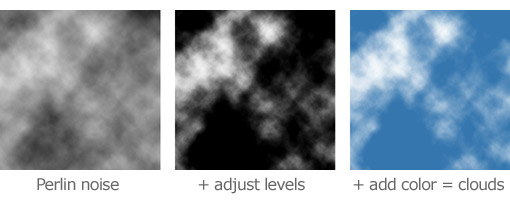
Making a texture

Perlin noise is specially well suited for clouds, as the own Ken Perlin explains in this presentation (a totally recommended read). Just to summarize how to go from Perlin noise to something resembling clouds:

The only problem with Perlin noise for js1k entries is that a perlin noise implementation is a bit too big for 1kb. It fits in 1kb, but it would not leave too much room for other code.

So I tried to make a texture similar to Perlin noise but by other method: a random walk. In the Wikipedia article about it you will find nice animations showing how it works. The only difference in my implementation, is that I don’t fill a full pixel at each position the walk traverses, but I just a bit, just like if I were using a non-full opacity brush, and this way it ends pretty similar to Perlin.

Random walk implementation details

The random walk needs a PRNG (pseudorandom number generator). As I wanted to create a cloud scene being always the same, I needed a PRNG with the ability to set its seed, and this way creating always on each run the same serie of (pseudo) random numbers.

Now a little problem was that Javascript’s Math.random doesn’t have the possibility to set the seed (not to mention each Math.random implementation would probably produce different results even with the same seed). So, I needed to implement my own PRNG, and to maintain it as little as possible… in js1k each byte counts.

This was my first implementation of the random walk with its own PRNG in 74 bytes:

m=Math.cos;for(x=y=n=9e4;n--;y+=m(x+=m(y*x)))a.fillRect(x%128,y%128,1,.1);

The result was this texture:

The problem with this implementation was that it was relying in Math.cos, and Math.cos doesn’t produce the same results across different browsers, as shown in the Ecmascript spec:

15.8.2.7 cos (x)

Returns an implementation-dependent approximation to the cosine of x.

So, the texture works the same on each run in the same browser, but in some browsers you get different results… so, next try:

for(x=y=l=i=9e4;i--;)l=l*i+i>>>1,x+=l%3-1,y+=1-(l>>4)%3,a.fillRect(x%128,y%128,1,.1);

It takes 11 bytes more up to 85, and we would not have set Math.cos in a single letter variable for posterior use as in the previous example, so in the end it is like occuping around 20 bytes more (a lot in js1k size terms). But it always renders this exact same result across all browsers:

Please note that the PRNG I created here is of extremely low quality, so while it is valid for my purpose it is not recommended for use in anything else. Search for high quality Javascript implementations of PRNGs with configurable seed - like Mersenne twister - if you need one for your own projects.
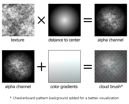
The Cloud Brush

Here I did the same as in my Christmas Tree from a previous js1k competition. First I create a cloud brush using the previously created texture:

Painting the brush multiple times:

Drawing the clouds scene

I use the noise texture again to decide where to paint a cloud brush. If the texture at (x, y) is above a threshold level, I paint the brush at a position determined by x and y.

I consider y determine how far are the clouds. Further brushes are painted first so nearer are painted on top. To add a perspective sensation, further clouds are painted littler than nearer ones.

Finally, since I’m using only one brush, if it is repeated along a totally straight line it would be very noticeable the repetition causing visible linear patterns. What I do is to use again the noise texture to offset a bit the final positionto paint the brush, and this way I avoid those visual artifacts.

Parallax displacement

Drawing the clouds scene takes almost all the time in the precomputation process, several seconds in the high resolution version even in a high end computer, so it is not possible to render it realtime with canvas right now.

What I did was to pre-render it into several layers (multiple canvases). I used 22 in the high res version, 11 in the low res version. Each layer contains a big amount of brushes painted on it, grouped by the distance to the camera:

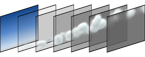
Moving the layers at different speeds, as I explained it in the CSS 3D Meninas post, cause the parallax 3d effect.

Heart-shaped rainbow

Could I have been more kitsch? Not sure, but it fits the love theme of the competition.

What I did was to draw multiple bezier curves, all with very few opacity and some displacement to cause the blurry effect common in rainbows and I used a canvas lighter composite operation to enhance its realism.

That’s it!

My Trip To Germany

20 de Junio del 2010

Few months ago I was invited to Merz Akademy by Olia Lialina to teach a CSS3 workshop for a week in June. I accepted, and it has been not only my first time visiting Germany but an amazing experience.

The Workshop at Merz

Classroom photo by Olia Lialina

First I have to say that Merz Akademy installations are excellent. The best place to study I’ve ever seen. During a week each semester, they invite 8 to 10 expert guests in different fields — music, film, graphic design… — to teach workshops to their students. The students are free to choose in which workshop they want to participate.

My workshop was about web coding with standars and an overview of CSS3. There were 17 students, all of them really nice people, it was a pleasure to work with them. A message to them: Hello! Come to visit me at Málaga, you have a free room here!

We spent the first two days on learning a bit of semantic html, a review of CSS1/2 positioning, CSS sprites… The next two days were spent in experimenting with CSS3 and making something artistical with it.

The last day, projection and presentation of the projects from all the workshops.

Our workshop: CSS3 Guernica by Picasso

In my opinion, one of the better ways to learn is by free playing an experimenting, so after the first days of good coding practices and real life web design examples, we started to play in an artistical and free way with CSS3 — just the same as I usually do with my blog CSS experiments. So, our project was not meant to be useful or applicable to real world web design, but an artistical experiment.

We cutted the painting Guernica in parts, one for each student, and we animated it with CSS3 transitions. You can see the result here:

http://id.merz-akademie.de/guernica/
* Note: it is for webkit browsers only, watch it from Safari or Chrome.

Visiting Smashing Magazine office

Vitaly Friedman and Román Cortés at the Smashing Magazine officeIf you are a common reader of this blog, I suppose there is no need to explain that Smashing Magazine is one of the most important web magazines on web design and development. Since it was at only 2-3 hours by car from Merz Akademy, I went to visit their office with one of the students (Hello Candogan!).

We met Vitaly Friedman, editor-in-chief of Smashing Magazine. He is a really nice person and it was a pleasure to meet him and talk to him in person.

Vitaly gave us signed copies of the Smashing Book (Vitaly, thanks again for the book!). I’ve fully read it right now, and I’ve to say that it is really a good book. If you are into web design/development and you are searching for a good book, I can’t recommend you anything better than this. It is easy to read, well designed in its content, structure and visually, and very complete. I would have like to have a book like this when I was learning web development, it took me years to achieve all the knowledge that is condensed in this single book.

Conclusion

It has been an amazing and intense trip and experience. I would like to thank everybody I’ve met and Merz Akademy for making it possible.

Dancing Typography

29 de Mayo del 2010

Dancing Typography screenshots

In this experiment/new visual effect, the letters from a lyric of a popular song – Never Gonna Give You Up — are repositioned to compose the images of its singer — Rick Astley — dancing in fluid motion. Take a look of it here.

It is an evolution of an experiment I did a month ago where text compose a static image. In this case, I modified the algorithm to achieve the smooth motion by making the  letters move the less as possible to be adapted to the next frame in the video.

As the previous experiment, this was thought to be done with Javascript/CSS, but I’ve finally had to recode it in Flash because the Javascript version was too slow rendering. This is why it is done with Arial font, so a big sorry to typography purists about it.

I’ve included an slider to morph from the lyrics to the video and two checkboxes, one for a interesting slow motion video where it is possible to see in detail how the letters move to create the different frames and a cinematic motion blur that also helps to see the motion, but that unfortunately requires a very fast computer to render at full speed. I hope you enjoy it!

Pure CSS3 Page Flip Effect

17 de Mayo del 2010

CSS3 Page Flip

By using CSS3 gradients, transitions, 2d transforms and clipping, I’ve achieved this pure CSS3 — without Javascript — page flipping effect.  By adding some Javascript it would be possible to do a full catalog viewer just like the existent ones done in Flash, but I wanted to try if it was possible to do it without Javascript… and it is!

It works in Webkit based browsers (Safari and Chrome) only. Take a look of it here.

A Tribute to The Beatles

24 de Abril del 2010

I’ve done this CSS/Javascript experiment as a tribute to The Beatles for its 50th anniversary.

Click on the lyrics!

It works on mostly all the browsers from IE5.5 and up. The best results will be shown if the system has Arial font installed on it and font-antialiasing is enabled. It will look good enough with Helvetica if Arial is not present, but probably not very good with other fonts.

Fit and Shrink Technique

11 de Abril del 2010

Here it is my latest CSS collaboration with Stu Nicholls: http://www.cssplay.co.uk/menu/fast.html

I had the idea for a pure CSS “content overflow detection” and coded it fast just to see if it would work, and it did work. So, I contacted Stu Nicholls from CSSplay to see if we could work together on an useful demo for the just discovered technique, and we have finished for the images “Fit and Shrink Technique” as Stu has finally named it. I’m always proud of collaborating with Stu, the king of CSS :)

 Tuve la idea de un “detector de overflow de contenido” en CSS puro. Es decir, algo que me permitiese realizar algún tipo de acción con CSS cuando el contenido de una página o de un div es mayor de determinadas dimensiones. Probé si mi idea podía funcionar, y lo hizo, así que contacté con Stu Nicholls para mostrárselo y ver si podíamos hacer juntos alguna demo útil con esta técnica. Lo que hemos hecho es un código que permite redimensionar una imagen de forma inteligente a unas dimensiones dadas, sólo con CSS y sin necesidad de Javascript o redimensionado vía servidor. Lo que hace es que dado un hueco con determinado alto y ancho para colocar una imagen (por ejemplo, 200×200 píxeles), si la imagen es más pequeña de dicho tamaño, se muestra centrada y si es más larga o ancha, se redimensiona manteniendo las proporciones.

 Sólo agregar que siempre es un placer y me siento honrado de poder collaborar con Stu. Él es el rey del CSS.

Scroll down CSS

5 de Abril del 2010

This is just a really simple CSS effect I’ve just done. I’m not sure if it is new or not, but it was fun to play with typography.

http://www.romancortes.com/ficheros/scroll_down.html

Esto es un efecto muy sencillito que acabo de hacer con CSS. No estoy seguro de si es algo nuevo o no (supongo que no), pero fue entretenido jugar con la tipografía.

Pure CSS Skull with Flames

10 de Febrero del 2010

(versión en castellano abajo)

This post is inspired by the comments on Reddit for my Pure CSS Coke Can effect:

Reddit comments

The comments of G_Morgan asking for a skull and l00pe for adding flames are just so hilarious that I decided to make it real.

This is, again, based in CSS displacement maps, and uses mainly CSS 1 and a few properties from CSS 2.1. It works on IE7, IE8, and the most of the latest browser - Chrome, Safari, Opera, Firefox.

I downloaded the voxel head medical image from the examples here a long time ago, but they have redesigned the website and I can’t find the link for the data. I also used the same data in my Flash voxel experiment. Please note that I did it as a collaboration with Mr. Doob, and it is stored in his server. Since he decided that his websites should not be shown on Internet Explorer, our common experiment is affected too, so it is not going to work on IE.

Castellano

Este post está inspirado por los comentarios que recibí en Reddit sobre mi efecto de la lata de Coca-Cola en CSS.

Varios de dichos comentarios eran humorísticos como suele ser habitual en Reddit. Dos de ellos me hicieron reir muchísimo: una persona dijo algo que se podría traducir aproximadamente como “Ahora lo que tienes que hacer es un efecto con una calavera”. Otra persona agregó: “¡No olvides las llamas!”. En ambos casos eran comentarios irónicos, pero me puse a pensar en lo divertido que sería hacerlo de verdad y… ¡aquí lo tenéis!

El efecto se basa en mapas de desplazamiento, al igual que la Coca-Cola. Es principalmente CSS 1 con alguna que otra propiedad de CSS 2 y funciona en todos los navegadores actuales.

Collaboration with Stu Nicholls / CSSplay

9 de Febrero del 2010

I’ve done a collaboration with Stu Nicholls for an infinite zoom effect with CSS3. I’m happy and glad of have had the oportunity of collaborating with him - he is not only the king of CSS but a really nice person. I hope this is not the last collaboration I do with him.

 Take a look of it here.