Román Cortés

Resultados de búsqueda

Collaboration with Ajaxian

8 de Febrero del 2010

After talking to Dion Almaer and solving problems with him and Ajaxian, now I feel in friendship with them, and to show it we have done a little collaboration were I’ve done 5 new CSS displacement map effects.

 Take a look of these here!

The Lack of Netiquette

1 de Febrero del 2010

NEW UPDATE 02/08/10: Please, read this post from Ajaxian.

IMPORTANT UPDATE:  Dion Almaer (the author of the post in Ajaxian) has personally apologized as you can see in the comments below.
Now I’m happy again. :)  Resentment is over. Thanks Dion.

In the last days I’ve been - and I am - really disappointed by Ajaxian’s lack of netiquette with me. They hotlinked the iframe of my lastest CSS experiment (the Coke can) without permission (and this is the second time they hotlink my job that way), stealing this way my bandwidth and my visitors. After I complained, they have not yet directly contacted me about it.

Well, first, what is Ajaxian? Maybe you already know it: it is a well-known, high traffic website that is usually considered a good source for web developing news and techniques.

On December, they hotlinked the effect iframe of my CSS Meninas post. They did it without even asking me, so I wrote a comment in their post asking them to write to me back. They didn’t.

I have a little rented dedicated server, and it is very limited in monthly bandwidth, cpu time and bandwidth per second. When a high traffic site like Ajaxian hotlinks me, my server starts to work to its limits, and that can easily make it go down, or I can reach my maximum allowed bandwidth. In the case of December, fortunately the server resisted that and I had no downtimes, so I just let it go and tried to forget the unrespectful/careless act from Ajaxian.

About a week ago I published the Coke can effect. Its popularity has been astounding: so much that in the first days it went, at the same time, to the frontpage of several big social news and aggregators websites. This made on January 26 my server to have hours of downtime.

On January 27, Ajaxian, again, hotlinked my content without my permission. Even if they linked me as author - and this is probably, the only correct thing they did -, since the post contained the full working effect, it was not clear enough to the users that they were not the authors of it. As a result, Smashing Magazine (probably the biggest and more important website on web design, with over 100k Twitter followers) twitted them for the effect instead of me. Also, people voted for it on StumbledUpon, getting it in the frontpage (as writing, it is in the frontpage yet, with 79k views) and re-tweeted it until making it the most twitted post of Ajaxian. All of these made them get the visitors while stealing my bandwidth. Not only that, but since the effect could be seen directly from their page, even the users who understood it was my job and not theirs did not visited my site because they had seen the effect already. This is why I think this is a way of stealing visitors too.

Data from Alexa, StumbleUpon and Topsy 

As you can see, my work doubled their traffic in the lastest days… in an already high traffic website (the Romancortes effect I might call it).

I’m mostly concerned with my bandwidth and my server stability, but, the thing is: they steal my bandwidth without permission or asking me, they steal visitors that should be mine and not theirs AND they show advertisements in their website. Since I doubled their visitors in these days with my original work and my bandwidth, should I think that they are, in fact, making money at my expenses?

Please, don’t think I’m a pro-copyright activist or something like that; I’m not. In the 99% of the cases, if you ask for permission to hotlink, or copy my content, or use my artworks or whatever, I will give it to you. But in this case, I think this has been just too much.

Ajaxian Rick Rolled

Hoping to receive a personal answer from them, I rick-rolled them. It was easy; since there were an iframe in their page pointing to the effect in my server, I had just to change content in my server. I did it in a friendly way, with some humor and trying to get their attention so they write a personal message to me. But nothing. No answer yet. They changed their post to avoid the rick-rolling and added this line: “[Edit: Fixed the hotlinking - well played Román - he Rick-rolled Us]”. That line is, in fact, for their users, but not a personal message to me. I’m thinking… how hard it could be to contact me with a personal message?

Finally, and as a conclusion, just to say that the lack of netiquette is, in fact, a lack of etiquette. The Internet medium makes the things to look ethereal as if there were not people involved there. But, we are involved, and we are people. If you do something not correct to a person in real life and the person complains, you usually will say “sorry”. Why not to do the same if the person is from Internet? Also, I believe big sites should take even more care with this. Since they are the most visited, they should try to be good examples on that. Unfortunately, it looks that it is not always this way.

Custom borders with CSS 2.1

1 de Febrero del 2010

Adding custom image-based borders for block elements with CSS 1 is painful. It usually requires adding a lot of extra markup that hurts semantics.

By other hand, with CSS 3, we have the powerful border-image property, wich allow us to add image-based borders easily, without extra markup and with new visual effects difficult to do with older CSS levels. Unfortunately, CSS 3 is being in development, not all browsers support it, and there is a long way to go until it gets mainstream.

The CSS 2.1 way to do it

I’ve search for middle way to do custom borders without the problem of adding extra markup of CSS 1, and more compatible than with CSS 3 properties. It is possible with CSS 2.1.

Pull-quote example

By using the CSS 2.1 pseudo classes :after and :before and setting their content property to an empty string (content: “”;), we can apply a lot of custom borders and background effects to block elements without additional markup. In the example above, I’ve done a pull-quote from a single <blockquote> element, that adapts to its inside text height.

So, what are the advantages of this method instead of using CSS3?

- Increased compatibility (it works even in IE8).
- Using a W3C recommendation - CSS 2.1 - instead of a working draft - CSS3 module border - makes no need for repeating properties in the CSS code for each browser (prefixes -moz, -o, -webkit, and so on).
- It is going to be completely mainstream a lot of time before CSS3 will be, so it looks as a more reasonable thing to learn today than the new CSS 3 properties if you are into real life web developing.

And… what are the disadvantages?

- More difficult to understand than the simple CSS 3 border-image property
- For round corners, you can probably do up to 3 of the 4 corners rounded for width and height resizable block elements… but not all the 4
- If you want all the corners with your custom images without adding markup, you will have a width-only resizable block element (looks as a good option for buttons) or an height-only resizable block element (like in my example).
- If you use CSS sprites like I did in my example, so you need only one image for the background, then you will be limited in resizing by the height or width of the image. You can always do very long images just as I did in my example.
- If you don’t use CSS sprites, you will need more than one image to load, and this is a disadvantage since CSS 3 border-image can work with a single image.

In next posts, I will probably follow the trend of showing cool effects and practical uses of CSS 3, but with this post I really want to remember you that there are a lot of possibilities with older CSS levels, and that it is really worth to continue studying them and experimenting with them.

Pure CSS Coke Can

25 de Enero del 2010


(versión en castellano abajo)

After doing the CSS Paper Bird effect, I found out that by a combination of the CSS1 properties background-attachment and background-position, 2D displacement maps could be created and, by scrolling, the displacement map would be applied to different parts of the texture (a background image).

With displacement maps lots of cool effects could be done, but thinking that the complexity of the displacement map would directly affect the CSS and markup size, choosing a good example took me some time. I thought in sea waves reflections, underwater distortions, magnifying glass, a rotating Earth… but the final thing I did was just right in my desktop: a Coke can - my favourite drink.

Due the cilindrical shape of a can, the displacement map is very simple with the parallel projection I did, so the code is very little - below 5kb - and easy to understand I hope.

Even if this effect is mainly CSS1 and some bits of CSS2 - for the scrolling div, overflow: auto property -, it is not going to work in IE6, because it doesn’t support background-attachment: fixed. I’ve tested it and it works in IE8, Firefox 3.5, Chrome 3, Safari 4 and Opera 10. Also, the code validates.

Castellano

Tras crear mi anterior efecto (post anterior a este), describí que con una combinación de las propiedades CSS1 background-attachment y background-position, se pueden crear mapas de desplazamiento y, mediante barras de scroll, estos mapas pueden moverse y aplicarse a diferentes partes de una textura (una imagen de fondo).

Con los mapas de desplazamientos se pueden hacer una gran cantidad de efectos interesantes, pero la complejidad del mapa afecta directamente al tamaño del código HTML y CSS. Encontrar un ejemplo apropiado cuya tamaño de código no fuese muy grande pero que produjese un efecto interesante me llevó algo de tiempo. Tras pensar en reflejos de olas, distorsiones submarinas, efecto lupa, la Tierra rotando, finalmente encontré el mejor ejemplo justo encima de mi mesa: una lata de Cola-Cola (mi bebida favorita).

Debido a la forma cilíndrica de la lata, el mapa de desplazamiento es sencillo con la proyección paralela que hice en el ejemplo, y por tanto el código es muy pequeño (menos de 5kb) y fácil de entender (espero).

Pese a que el ejemplo funciona principalmente con CSS1 (y overflow: auto de CSS2), no funcionará en IE6; no soporta la propiedad background-attachment: fixed. Lo he probado en los navegadores actuales y funciona correctamente, y el código valida.

CSS Paper Bird

21 de Enero del 2010

(versión en castellano abajo)

In this experiment I took a serie of paper bird (crane) photos with different illumination positions I did some time ago, and I’ve created a pure CSS effect - without Javacript - to show them one by one depending on the scrollbars positions.

Please, drag the thumbs/sliders along the tracks to see the effect.

I’ve tried the effect and it works in IE8, Safari 4, Firefox 3.5, Chrome 3, Opera 10 and the code validates. It doesn’t work in IE6.

Castellano

En este experimento he usado una serie de fotos a una pajarita de papel con diferentes posiciones de iluminación que hice hace tiempo, y he creado este efecto CSS puro (sin Javascript) que muestra las imágenes de una en una dependiendo de la posición de las barras de desplazamiento.

Arrastra los deslizadores de las barras de desplazamiento para ver el efecto.

Lo he probado y funciona en los navegadores actuales y el código valida. No funciona en IE6.

3D Meninas explained

17 de Diciembre del 2009

A lot of people is asking me how my Pure CSS 3D Meninas effect works and how I did it. In this post I will try to fully explain it, from the image edition part to the html/css coding part. Even if this is going to look like a tutorial, please, don’t take it as a tutorial; this effect is just an experiment and not thought to be useful or a good practice in web design.

Bastantes personas me han pedido que explique cómo hice y cómo funciona mi efecto 3D de las Meninas con CSS. En este post voy a intentar explicarlo al completo, empezando por la edición de imágenes y terminando con la parte de código html y css. Por favor, no toméis esto como un tutorial; va a parecerlo, pero el efecto es sólo un experimento y no está pensado para que sea útil ni una buena práctica de diseño web.

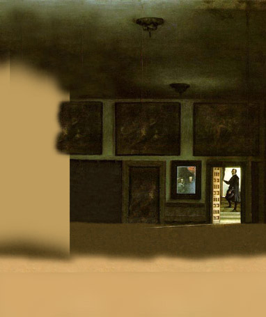
Finding the vanishing point / Encontrando el punto de fuga

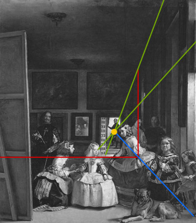
Trace 2 lines (in green) following the 3d parallel lines in the right wall until they cross. The crossing point (in yellow) is the vanishing point. Trace two lines following the right and bottom corners of the back wall (in red). A line crossing the vanishing point and the intersection of the two red lines (in blue) defines the corner of the ground with the right wall.

Traza dos líneas (en verde) siguiendo las paralelas en 3d de la pared de la derecha hasta que se crucen. El punto de cruce (en amarillo) es el punto de fuga. Traza dos líneas siguiendo las esquinas inferior y derecha de la pared del fondo (en rojo). Una línea que pasa por el punto de fuga y la intersección entre las líneas en rojo (en azul) define la esquina que forma el suelo con la pared derecha.

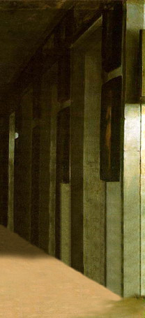
Layers’ movement speed / Velocidad de movimiento de las capas

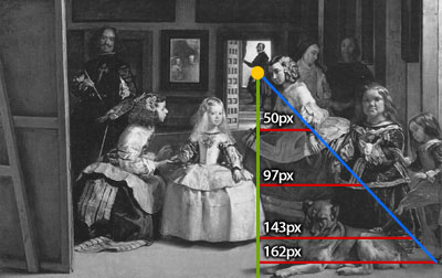
When moving the layers to make the parallax effect by displacing the vanishing point as in my effect, the relative speed of these is inversely proportional to the height from the vanishing point to the ground. The red horizontal lines are proportional in width to this height too (Intercept theorem), and I believe it is easier to see it this way. If you want to move the viewer instead the vanishing point, the speed would be directly proportional instead of inversely.

Al mover las capas para crear el efecto 3d parallax, la velocidad de cada capa ha de ser inversamente proporcional a su distancia vertical desde el punto de fuga al suelo. En la imagen, las líneas rojas horizontales son proporcionales en largo a esta distancia (primer teorema de Tales), y creo que así se entiende bastante mejor. Si en vez de mover el punto de fuga, moviésemos al espectador, la velocidad de las capas sería proporcional en vez de inversamente proporcional.

Cutting the images / Recortando las capas

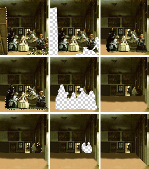
This is the part that takes more time: cut a layer and place it apart, fill the holes, cut another layer, and so on. Obviously it is not required to paint parts of the image that are going to be occluded in the effect.

Esta es la parte en la que se tarda más: corta una capa y déjala aparte, rellena los huecos, corta otra capa y así. Obviamente no es necesario pintar las partes de la imagen que van a quedarse ocultas en el efecto.

CSS Sprites / Sprites CSS

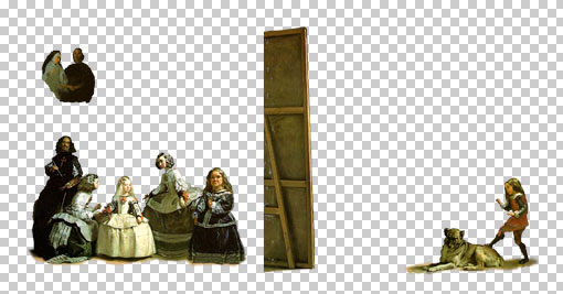
In this example I’ve used the CSS sprites technique, wich consists in making a big image containing different images, and then show these cutted by CSS. By reducing the number of files a website have to request to the server, the loading time get decreased. The layers look like this:

En este ejemplo he usado la ténica de sprites CSS.

So, how to make a CSS Sprite? Use a block element with the sprites file as background-image, with the width and height of the sprite you want to take, and background-position defining the offset of it in the whole sprites image. Remember that the background positions should be negative.

¿Cómo hacer un sprite CSS? Usa un element block al que le asignas de background-image el fichero de sprites, con el ancho y alto del sprite que quieras tomar y de backgrond-position la distancia hasta la esquina superior izquierda de la imagen de sprites completa. Recuerda que las posiciones del fondo deben ser negativas.

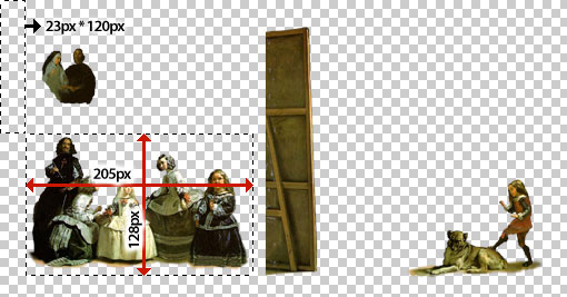
<div style=”background-image: url(’meninas-sprites.png’); width: 205px; height: 128px; background-position: -23px -120px”></div>

Complex hover effects / Efectos complejos de hover

Current browsers support complex hover effects for all tags and allow changes in child tags caused by the hover of the parent tag. Let’s take a look of the following code:

HTML:

<a href=”#” mce_href=”#”><img src=”something.jpg” mce_src=”something.jpg” />Some text here <span>and more text here</span></a>

CSS:

a img {position: absolute; top: 500px; left: 300px;}
a:hover img {top: 400px;}
a:hover span {font-weight: bold;}

With this code, when hovering the <a> element, the image with change of position, and the text between the <span> tag will change its weight to bold. As you can see, it is easy to make really complex hovers modifying different properties of different elements inside the main hovered tag.

Los navegadores actuales soportan efectos complejos de hover para todas las etiquetas y permiten cambios en etiquetas hijo causadas por el hover de etiquetas padre.

En el ejemplo, al pasar el ratón por el elemento <a>, la imagen que contiene cambiará de posición y el texto contenido en el <span> cambiará a negrita. Como veréis, se pueden crear de esta forma efectos bastante complejos, modificando propiedades de diferentes elementos dentro de la etiqueta que causa el hover.

How the layers move by the mouse position? / ¿Cómo se mueven las capas según las posición del ratón?

There are 80 vertical hover elements of 5*455 pixels each, covering the full effect. Each hover element contains inside elements to define every layer position, the background image and the lateral background image. When the hover element is not active (without the mouse over it), all is inside elements showing images are hidden, with display: none.

When the hover element is active, the images are set to display: block, and the position of these are set. These positions have been calculated and are written in the CSS code for each layer and each of the 80 vertical hover elements. This is what does the magic.

Since the hovering elements are overlapping, there is a little problem to do this, because once the element is hover and shows its inside images, all the area is part of the hover, so it will not switch to other hover element until you move your mouse outside the effect.

So, how to make it work? The solution I found was to use z-indexs and spans with   on top of the images. This looks to work fine with all the current browsers.

Hay 80 elementos verticales con hover de 5*455 píxeles cada uno, cubriendo así todo el area del efecto. Cada uno contiene elementos internos que definen la posición de cada capa, la imagen de fondo y la imagen lateral de fondo. Cuando el hover no está activo, todos los elementos internos con imágenes están ocultos con display: none.

Cuando el hover está activo, las imágenes aparecen como display: block y en sus posiciones correspondientes. Estas posiciones han sido calculadas y están escritas en el código CSS directamente, para cada capa y para cada uno de los 80 elementos con hover. Esto es lo que “hace la magia”.

Hay un problema en esto porque los elementos se superponen. Al activar el hover y mostrarse las imágenes, el navegador considera que todo el area pertenece a ese hover y no se puede cambiar de un hover a otro. La solución que encontré fue hacer una mezcla de z-indexs y spans con   de forma que las areas de hover siempre permanezcan por encima de las imágenes. Esto parece que funciona bien en todos los navegadores actuales.

Right background lateral / El lateral derecho del fondo

A true parallax effect would be not only 4 or 5 layers, but a layer for every vertical 1-pixel-height line on the ground/ceiling. This would be 2 or 3 hundreds of layers. The html/css code for it would be a lot of bigger, and also the browsers would not be able to render it in a decent speed.

So, I had to find a way to make it look reasonably good but with a simpler way, so what I did was to divide the background in two parts:

Then, while the first image is only displaced, the second image with the right lateral is displaced and resized. You can not resize CSS sprites or background-images, but you can resize <img> elements by setting the width and height desired.

Un verdadero efecto de parallax no hubiese sido de sólo 4 o 5 capas, sino de una capa por cada pixel de altura del suelo/techo; 200 o 300 capas. El código html/css para ello sería muchísimo mayor, y los browsers actuales no podrían renderizarlo a una velocidad aceptable. Por tanto, tuve que buscar una forma con la que se viese lo suficientemente bien el efecto pero fuese más simple. Lo que hice fue dividir el fondo en dos partes, tal y como se ve en las imágenes superiores.

Mientras la primera imagen sólo se desplaza, la segunda imagen de la pared de la derecha se desplaza y también se redimensiona. No se puede redimensionar los sprites CSS, pero sí que se puede redimensionar los elementos <img> asignándoles el ancho y alto deseado.

Source code / código fuente

Some people asked me for the php script I used to generate the html. I consider it is not very valuable but… here it is.

Varias personas me han pedido que muestre el código en php que usé para generar el html. No creo que sea demasiado interesante pero… aquí lo tenéis.

CSS 3D Meninas

14 de Diciembre del 2009

(versión en castellano abajo)

I’ve took the classic paint The Maids of Honour (Las Meninas) and made this CSS pseudo-3D/parallax effect. It is pure CSS, so no javascript or flash involved: only CSS and HTML code.

It has been tested and it is working on Internet Explorer 8, Firefox 3, Opera 9, Safari 3, Chrome 4 and Konqueror 3.5, and it validates.

UPDATE: 3D Meninas Explained

Castellano

He tomado el cuadro Las Meninas y he creado este efecto pseudo-3D con CSS. Es CSS puro, sin javascript ni flash; sólo código CSS y HTML.

Para la realización he usado tres imágenes: dos se corresponden al fondo (paredes) y otra de sprites (3 sprites: uno con el lienzo, niño y perro, otro con las meninas, y el último con la monja y acompañante). El posicionamiento de los sprites se realiza mediante hover en un total de 80 anchors. El lateral derecho de la habitación se ensancha y contrae para mejorar el efecto 3D.

Hay algunos truquitos para que el hover funcione correctamente, podéis verlos en el código fuente. Para que no interfieran las imáges en el hover, he usado distintos z-indexs y nbsps con tamaño de fuente de 455 píxeles: el mismo alto que el experimento en sí.

Funciona en las últimas versiones de los navegadores más usados y valida.

UPDATE: Explicación del efecto

Tutorial: mejora el aspecto de tu web

1 de Abril del 2009

En este tutorial he recopilado los mejores trucos, consejos y secretos para darle un aspecto profesional y visualmente atractivo a vuestras páginas web.

Titulos vibrantes

1) Desde Photoshop, escribe el título que desees publicar con una fuente bonita (Comic Sans suele ofrecer buenos resultados).

2) Rasteriza la capa de texto y aplícale un bonito degradado multicolor con la herramienta de degradado.

3) Por último, aplica una sombra al texto. Las sombras siempre mejoran el resultado. Procura que la sombra sea los suficientemente intensa para que no pase desapercibida. Aquí el resultado final:

Bordes tridimensionales en imágenes

1) Toma una bonita imagen de tu mascota (preferiblemente un gato)

2) HTML y CSS soportan bonitos bordes con efecto tridimensional mediante el siguiente código: <img src=”gato.jpg” mce_src=”gato1.jpg” style=”border-style: outset; border-width: 30px”>

Iconos animados

Hay multitud de iconos gif animados disponibles en Internet. Úsalos para destacar las secciones más importantes de tu web, como en tu dirección de correo. De esta forma, al mismo tiempo que decoras tu web, ¡nadie se olvidará de escribirte!

Mejores imágenes mediante filtros de Photoshop

Existen multitud de filtros para imágenes en Photoshop. Os recomiendo: Invert, Embeed y Lens-flare.

###

Por hoy eso es todo y espero que os haya sido de gran ayuda.  Próximamente publicaré la segunda parte de este tutorial con más consejos y trucos.

¿Novedad de Adsense?

2 de Noviembre del 2008

Acabo de ver algo muy curioso en Adsense, de lo que no tenía noticia y de lo que no he podido encontrar información al respecto. Me pregunto si soy la primera persona en percibirlo…

Parece ser que Adsense usa la cadena buscada en Google para modificar la publicidad que aparece en la página a la que se visita. Un ejemplo concreto:

Desde Google.com (versión en inglés internacional) buscad estas dos cadenas:


(las cadenas están como imagen para no modificar los resultados)

En ambas búsquedas, mi entrada de Homer CSS en el blog debería aparecer la primera entre los resultados de Google. Al entrar en esta página, la publicidad será diferente; en el segundo caso incluirá publicidad relacionada con la primera palabra de dicha cadena.

La técnica de sprites CSS

26 de Octubre del 2008

Empiezo a recuperarme de la gripe que ha hecho que no escriba durante la última semana, así que vuelvo a la carga con el blog.

Revisando mis posts anteriores he descubierto que se me olvidó hablar de los sprites css en mi post Webs más rápidas. Es una técnica que consiste en agrupar varias imágenes en una sola de mayor tamaño, para luego volver a separarlas en imágenes individuales mediante CSS. La ventaja es que reduciremos el número de archivos de nuestra web, lo que probablemente mejorará la velocidad de carga (explicación detallada en el post de Webs más rápidas).

Uno de los ejemplos de uso de esta técnica lo aplica Google en sus resultados de búsqueda (ejemplo). Esta es la imagen que agrupa los sprites (imágenes más pequeñas):

(He agregado un borde en gris para que se aprecien mejor los bordes de la imagen)

Como podéis ver, tenemos el logotipo de Google y varios botones que se usan en diferentes secciones de la página de resultados. Existen al menos dos formas de usar estos sprites, es decir, de separar las imágenes. Una de estas formas es usando un div al que le definamos width y height del tamaño del sprite, overflow como hidden, una background-image que se corresponda con el fichero de imagen que contiene los sprites y un background-position definido en píxeles. Estos píxeles se contarán de forma negativa desde la coordenada superior izquierda. Podría ser también cualquier otro tipo de tag, por ejemplo un a, y en ese caso, al ser un elemento inline deberíamos definirlo como block para que funcione correctamente en todos los navegadores como elemento pulsable.

Por otro lado está el método que usa Google. Se trata de usar dos elementos embebidos. El primer elemento (por ejemplo, un div) define el tamaño en píxeles del sprite y overflow hidden. El segundo elemento es un img, que como src tiene a la imagen grande y como estilo position: relative, top y left en píxeles. Los desplazamientos también se harán de forma negativa al igual que en el anterior.

Esta última posibilidad tenía problemas con la primera beta de IE8, pero en la segunda beta (la más reciente cuando escribo este post) ya parece estar corregido el bug.

Google lo hizo bien… pero se puede mejorar

Las páginas de Google son siempre bastante ligeras y rápidas de carga, está claro que es uno de los puntos fuertes que tienen en su buscador y que trabajan bastante en ello. El uso de sprites CSS es un buen ejemplo de optimización al respecto; menor tiempo en la solicitud de archivos, menor número de paquetes enviados y recibidos (y por tanto menor cantidad de datos enviados y recibidos), etc.

En cualquier caso, su implementación no es la mejor posible. Dejando de lado la semántica (que brilla en su implementación por la ausencia), tiene un grave problema de accesibilidad; en concreto en la forma en la que han implementado la evaluación con estrellas:

Por cada producto evaluado, se muestra una puntuación de entre 0 y 5 estrellas, incluyendo saltos de media en media entrella. Para cada una de las estrellas han usado un sprite (un <p><img></p>). A cada una de las imágenes les han puesto un alt, de esta forma, al pasar sobre cualquier punto de la puntuación se muestra con texto la puntuación (desde IE). El problema es que en un navegador en braille o audio, cada puntuación será repetida 5 veces.

De entre las posibles opciones de mejora, he optado por una que fuese más accesible, con mejor semántica, ocupase menos espacio, fuese más simple de implementar y no tuviese ninguna desventaja. Aquí os la muestro:

Conociendo la forma en la que png comprime las imágenes, es fácil de entender que las repeticiones suelen comprimirse muy bien y apenas incrementan el tamaño del archivo. En este caso con 40 bytes más, tengo una formación de estrellas y una imagen levemente más grande. Nótese que el resto de imágenes permanecen idénticas.

De la forma en la que he agrupado las estrellas, tomando rectángulos de 5 estrellas de largo por 1 de ancho, puedo mostrar todas las posibilidades de puntuación diferentes. Así, un solo sprite será suficiente para toda la línea de estrellas, y por tanto un solo alt.

Al necesitar sólo un sprite por puntuación, y pensando en un listado de 10 productos (10 puntuaciones), reduzco el número de sprites al 20%, es decir, elimino 40 sprites. Esto hace un total de aproximadamente 5kb sin compresión. Por otro lado, aumento el código CSS en aproximadamente 350 bytes sin compresión. En total, para conexiones sin compresión, el tamaño en el que reduciría mi método la carga de la página sería de algo más de 4kb.

La mayoría de los navegadores actuales soportan compresión, así que este último dato es de poca relevancia. Mediante compresión zip, la diferencia es mucho menos apreciable; reducción de ~300 bytes en el html, adición de ~180 bytes en css y ~40 bytes en el png. Total: ~80 bytes más ligero con mi método.

Nota: los datos de reducción de tamaño sólo los he incluido de forma anecdótica, la única ventaja real de mi implementación es la de accesibilidad.